
- Sparx Science
Exposing misconceptions through careful font choice
 Dan Gosselin|January 28, 2026
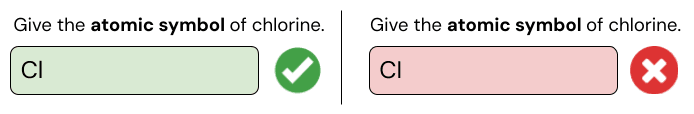
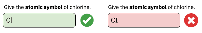
You ask a class to write the atomic symbol for chlorine. They hold up their mini-whiteboards, and you are happy to see that they have all written “Cl” as you expected. You move on - happy that students have understood atomic symbols.
Later that week, they asked the same question in their online homework. One student writes Cl, gets it right, and moves on. Another types what looks like exactly the same answer, yet it’s marked wrong. They can’t understand why what they wrote in the lesson is now being marked incorrect.
What is happening?
We first spotted this issue during our regular review of how students are answering our questions. Of 29,556 attempts at the question above, 22.8% of pupils found themselves in the situation on the right - where the answer is marked wrong, despite looking correct.
Looking at this alone it is hard to see what is happening, but it is actually the font hiding the mistake.
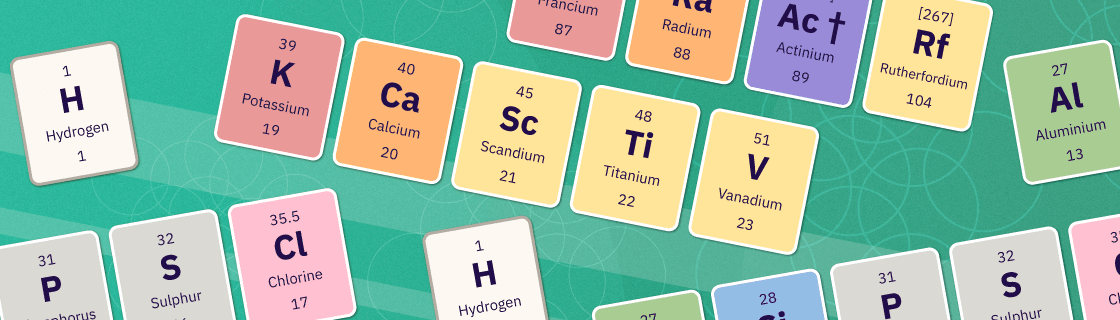
To help you see the challenge, I’ve listed 7 different elements in fonts commonly used in classrooms below.
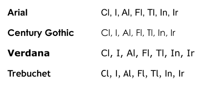
In many standard fonts, a lowercase "l" (L) looks identical to an uppercase "I" (i).
We therefore theorised that for students, one of two things was happening:
- They were reading "Cl" on the periodic table as a capital i and typing that instead.
- They were reading it correctly as a lowercase L but writing it incorrectly because the characters looked identical on their keyboards and screens.
Without asking the students directly, we cannot know for sure from our data whether students have a misconception around the conventions for atomic symbols, or it's the font on their keyboards that is throwing them.
One option is to change the question to multiple choice. It would eliminate the typo risk immediately. But the student may still be confusing an uppercase i and lowercase L, so whilst it would appear to solve the problem, it could maintain the misunderstanding and also reduce the challenge of the question.
What did we do?
So we focused on something we can control - the font.
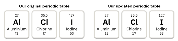
Since March, we have used IBM Plex Sans for our Periodic Table. As you can see, this font gives us a clear distinction between i and l.
After this single change, we saw a 54% drop in students giving "CI" (with an uppercase i) instead of "Cl" (with a lower case L), showing that our first theory about incorrectly reading the periodic table was one part of the puzzle here.
But the issue was still persisting in some attempts, and we wanted to ensure that where it did, it was because of misconceptions about how to write atomic symbols, and not the font. Therefore, Sparx users may have noticed a subtle but important change recently, as we have now updated all question and answer text in Sparx Science to use IBM Plex Sans.
So now, the original answers from above would appear like this:
Importantly this means that not only do students clearly see what they are submitting, but teachers are able to clearly see where the student has gone wrong and provide additional guidance if needed. This has led to a further 21% drop in students incorrectly using capital i/lowercase L across our question bank.
This change has had positive impacts not only in our questions about elements, but also around state symbols, where capital i has sometimes been used for a lowercase l when writing the state symbol for liquids.
How can you support your students?
We shared this because everyone here in the Science team found this small insight from amongst our vast amount of answer data incredibly interesting. With blurred lines between digital font and handwritten answers, we are sure that for a small number of students, this misconception may go unseen in the classroom. And it’s one that is particularly difficult for teachers to spot.
So to support you, we’ve created a new, high-clarity Periodic Table using our distinct font available to download, print, and use in your classroom, as well as a bank of specially designed element symbols that you can use in slides.